Schmuck-Fritz Gallery&Workshop
Untypical e-commerce for the old creative
business.
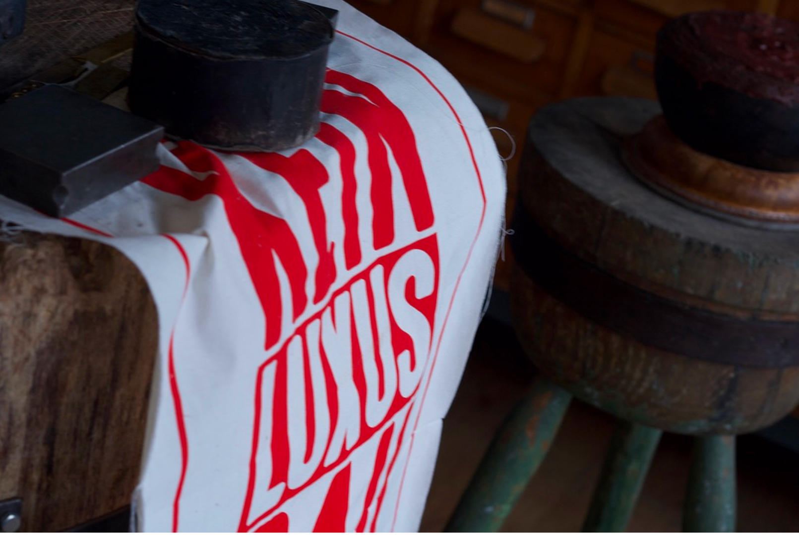
Product Designer
Web
Fig Jam, Figma, Adobe
Photoshop,
Canon mirror camera
Canon mirror camera
1 month
Introduction
Interest in art and culture lies beyond basic needs. During the Renaissance, art became accessible not only to the church, but also to the elite. In an era of democracy, it belongs to all of us. Since ancient times, jewelry has been a tool for conveying religious contexts and status attributes. Which carries a strong emotional charge.
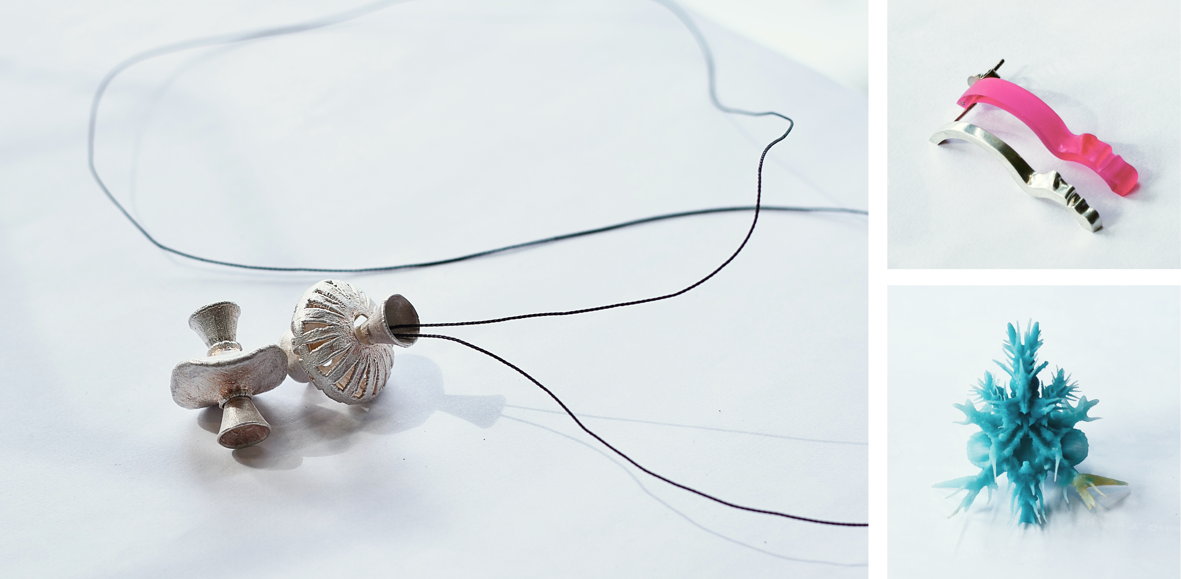 (c) Images: SCHMUCK-Fritz Gallery&Workshop collection - fairy use.
 This is a good opportunity to pick up a practical item that creates accents of individuality while visiting a jewelry gallery, which has biggest contemporary jewelry collection in Berlin from the different times and more than 60 artists from all around the world. You can find it easily walking throw Kreuzberg, but it becomes difficult to find ti online. German word “SHMUCK” , which is the name directly translates as a “jewelry” and we became everything possible just googling “Schmuck”. And here is a thing.

(c) Images: SCHMUCK-Fritz Gallery&Workshop. Facade of the building - fairy use.
Competitor analysis
In the competitive landscape of jewelry galleries in Berlin, standing out requires a strategic approach to engaging customers and showcasing unique offerings. Leveraging insights from competitors can help refine our approach and enhance customer experience.
Research and problem satement
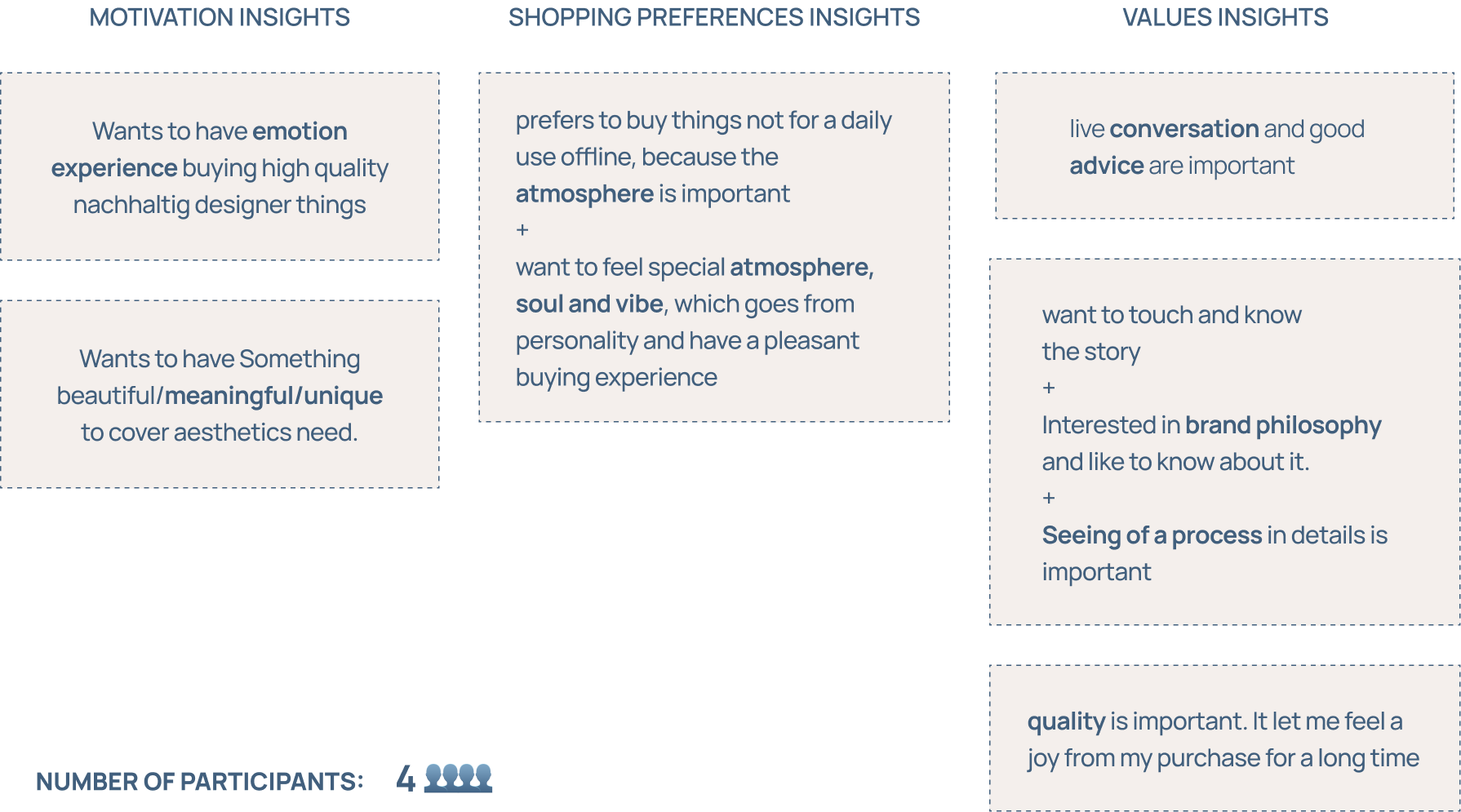
Interviewing business owners and four people from prospective client auditory, I got next insights. That they are interested in seeing of a process in details, wants to have beautiful/meaningful/unique artifact to cover aesthetics need and that is especially important - to feel a soul and vibe, which goes from personality of the Maker or Gallery Owner and can make them decide to make a purchase throw a conversation.
During the Customer interview I also learnt that they already have a lot of regular customers, who are coming once a couple of years making their trip to Berlin, but have no opportunity to find “SHMUCK Fritz” online.
Solution
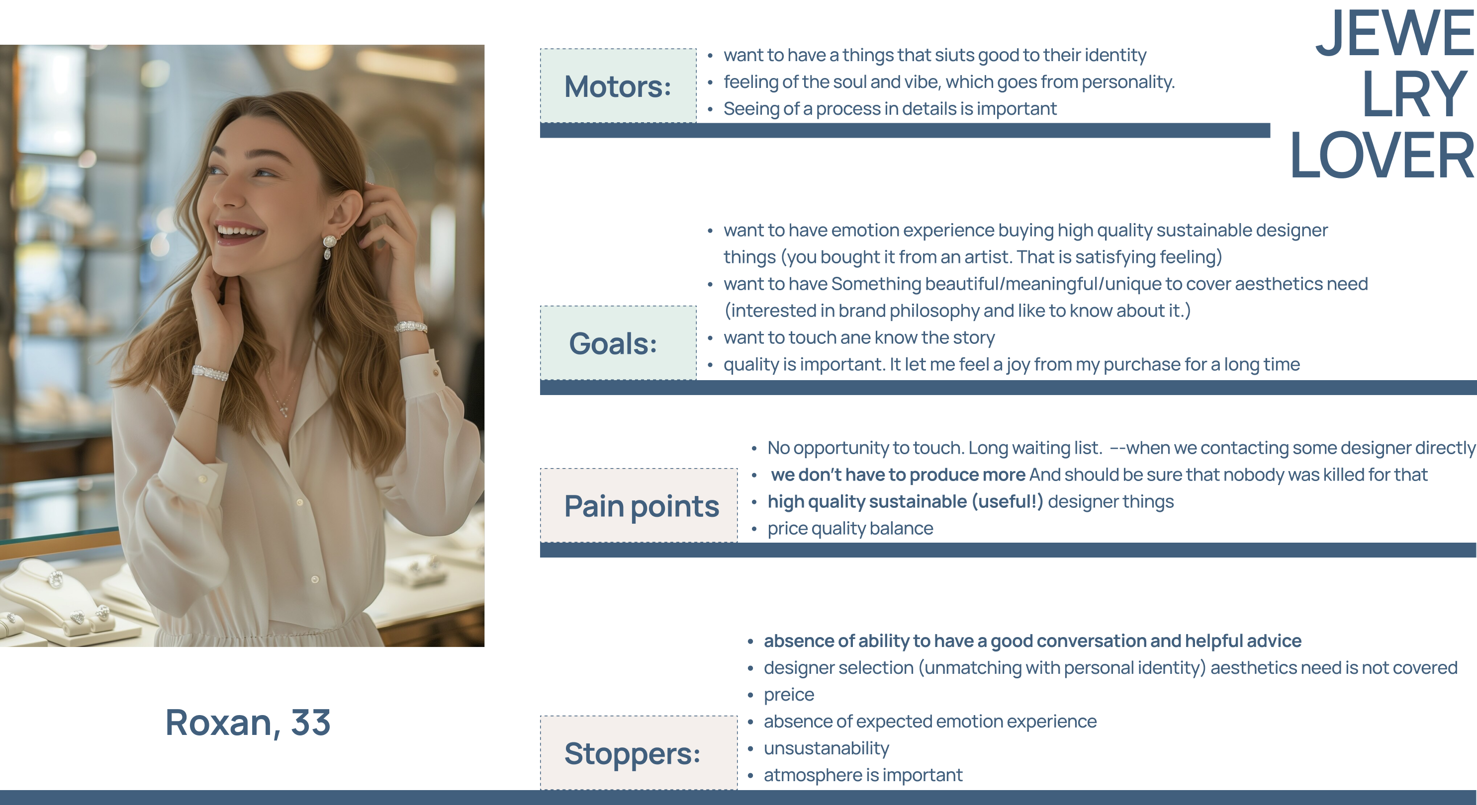
Understanding the target audience is crucial for designing effective products and services. One of the most effective
tools for achieving this understanding is the creation of user personas. These fictional representations of ideal users
help guide design decisions and ensure that the end product meets the needs and expectations of its users.
Meet Roxan: She is 33 years old, lives in New york, works remoulty and trevels a lot. She is enjoing all kind of arts, and collecting unique contemporary jewelry pices. Also during her trips. Last summer she has been in Berlin and bought earrings for herself in "SHMUCK-Fritz" Jerwelry Workshop&Gallery. But then, when she was thinking about the gift for her sisters' bisthday, unfortunetly she didn't found this Berlin Gallery online.
Meet Maria: They are 54 years old, lives in München and works in their jewelry Studio. Maria has enough wedding bands' orders, but she is creative person and would like to sell their conceptual jewelry as well. But has not skills and time to organize this process.
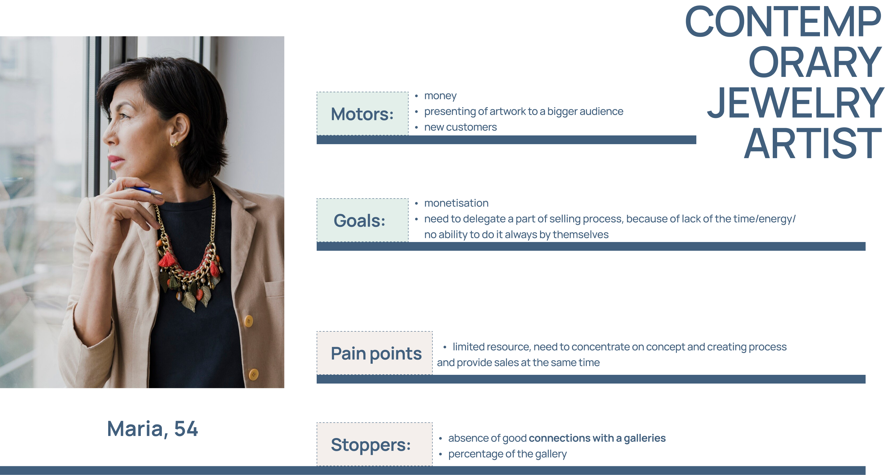
The gallery specializes in creating custom orders, including wedding bands, allowing customers to bring their unique visions to life. Additionally, it conducts masterclasses in collaboration with a college, providing educational opportunities for those interested in jewelry-making. Although the gallery has previously hosted events and exhibitions, the experience has not been as successful as desired, particularly when considering the limited resources and individual interests involved.
Given this context, I believe it is crucial to concentrate on the gallery’s stronger points and leverage its unique offerings. By focusing on showcasing an amazing collection of art pieces online, we can create a more robust presence and attract a wider audience. The gallery itself serves as the Minimum Viable Product (MVP), providing a foundation for growth while emphasizing quality and artistry.
I have developed a happy User Journey, where a user can achive their primary Goal: to experience positive emotions during their shopping experience. This journey is carefully structured to minimize strong peaks and low points, ensuring a smooth and enjoyable process from start to finish.
Meet Roxan: She is 33 years old, lives in New york, works remoulty and trevels a lot. She is enjoing all kind of arts, and collecting unique contemporary jewelry pices. Also during her trips. Last summer she has been in Berlin and bought earrings for herself in "SHMUCK-Fritz" Jerwelry Workshop&Gallery. But then, when she was thinking about the gift for her sisters' bisthday, unfortunetly she didn't found this Berlin Gallery online.

Meet Maria: They are 54 years old, lives in München and works in their jewelry Studio. Maria has enough wedding bands' orders, but she is creative person and would like to sell their conceptual jewelry as well. But has not skills and time to organize this process.

The gallery specializes in creating custom orders, including wedding bands, allowing customers to bring their unique visions to life. Additionally, it conducts masterclasses in collaboration with a college, providing educational opportunities for those interested in jewelry-making. Although the gallery has previously hosted events and exhibitions, the experience has not been as successful as desired, particularly when considering the limited resources and individual interests involved.
Given this context, I believe it is crucial to concentrate on the gallery’s stronger points and leverage its unique offerings. By focusing on showcasing an amazing collection of art pieces online, we can create a more robust presence and attract a wider audience. The gallery itself serves as the Minimum Viable Product (MVP), providing a foundation for growth while emphasizing quality and artistry.
I have developed a happy User Journey, where a user can achive their primary Goal: to experience positive emotions during their shopping experience. This journey is carefully structured to minimize strong peaks and low points, ensuring a smooth and enjoyable process from start to finish.

Dialog is a cern. So basically all the smooth
User flow
from everywhere leads to this communication, which starts with a
Contact form
next to every service and item we want to present. We are going
to provide the most complete information, but at the same time — always staying open to discussion. With live
communication, same as it could be with “SCHMUCK- Fritz” offline experience.

Establishing a cohesive brand identity is essential for any business, as it helps convey a clear message and connect with customers. By integrating existing materials and focusing on design elements that reflect the brand's essence, we can create a unified visual experience.
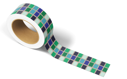
I integrated all the existing materials from my customer into a comprehensive brand system. This foundation allowed me to ensure consistency across all touchpoints before moving forward with a dedicated design system. I chose Brand color system inspired by the facade of the building, ensuring that the palette resonates with the physical space and reinforces the brand's identity. Additionally, I utilized the existing logotype, featuring a skeleton of a flamingo, as a focal point for the design. To further align the brand's visual identity, I selected a font that closely resembles the typography found on the building, creating a strong connection between the brand and its physical location.
By bringing together existing materials and thoughtfully selecting design elements, I have crafted a cohesive brand and design system that reflects the unique character of my customer’s business. This approach not only strengthens brand recognition but also fosters a deeper connection with the audience, ultimately enhancing their overall experience.
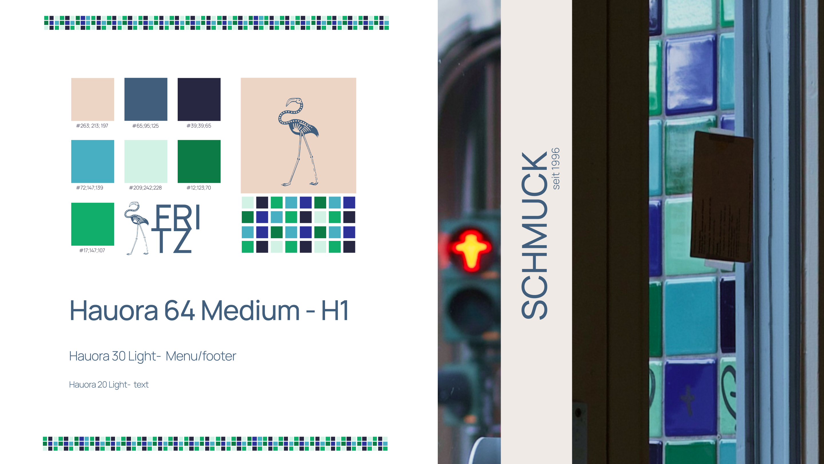
Concept testing: Driving Moderated User Tests I spoke with 10 people, living in Berling. I showed them the header design, usking about do they know some place like this. And fortunently 6 of 10 responsed something as "Yay! I remeber this place!!! It is a jewelry store! What is its' name?" - "Shmuck", just "Schmuck"... - I answered, - But I am happy, that it works"..
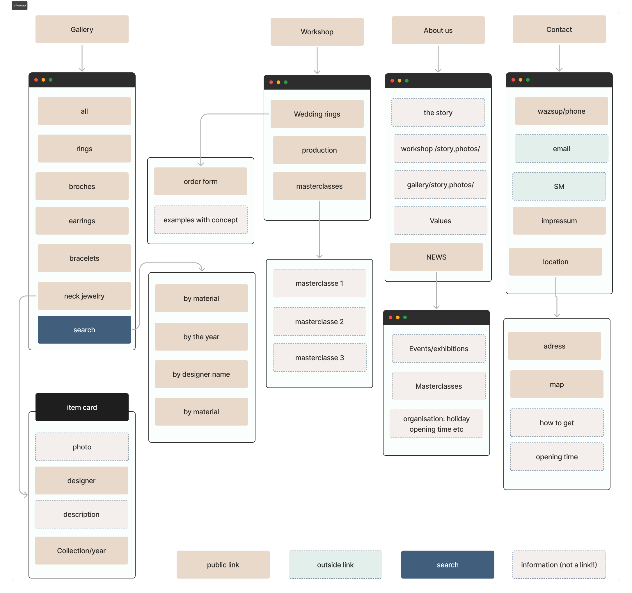
During a lot of iterations, I build a web site Information Architecture, categorizing services and items in a gallery, providing structured information for each one separate piece (title, description, year of produce, artist name and name of collection), testing it on the early stage and each one time bringing the correctives. On the image belove you can see the final resut.
I put a lot of attention into “About us” and “Contact” sections, regarding to a users need to know about the story and inner processes more, implemented a high-quality photo content of the workshop and gallery today and also some of old, already historical for my customer business, photographies.
I created high-quality photo content and raised the old archive of stories and photographs in order to create an About page to give the client the opportunity to feel the atmosphere and vibe.
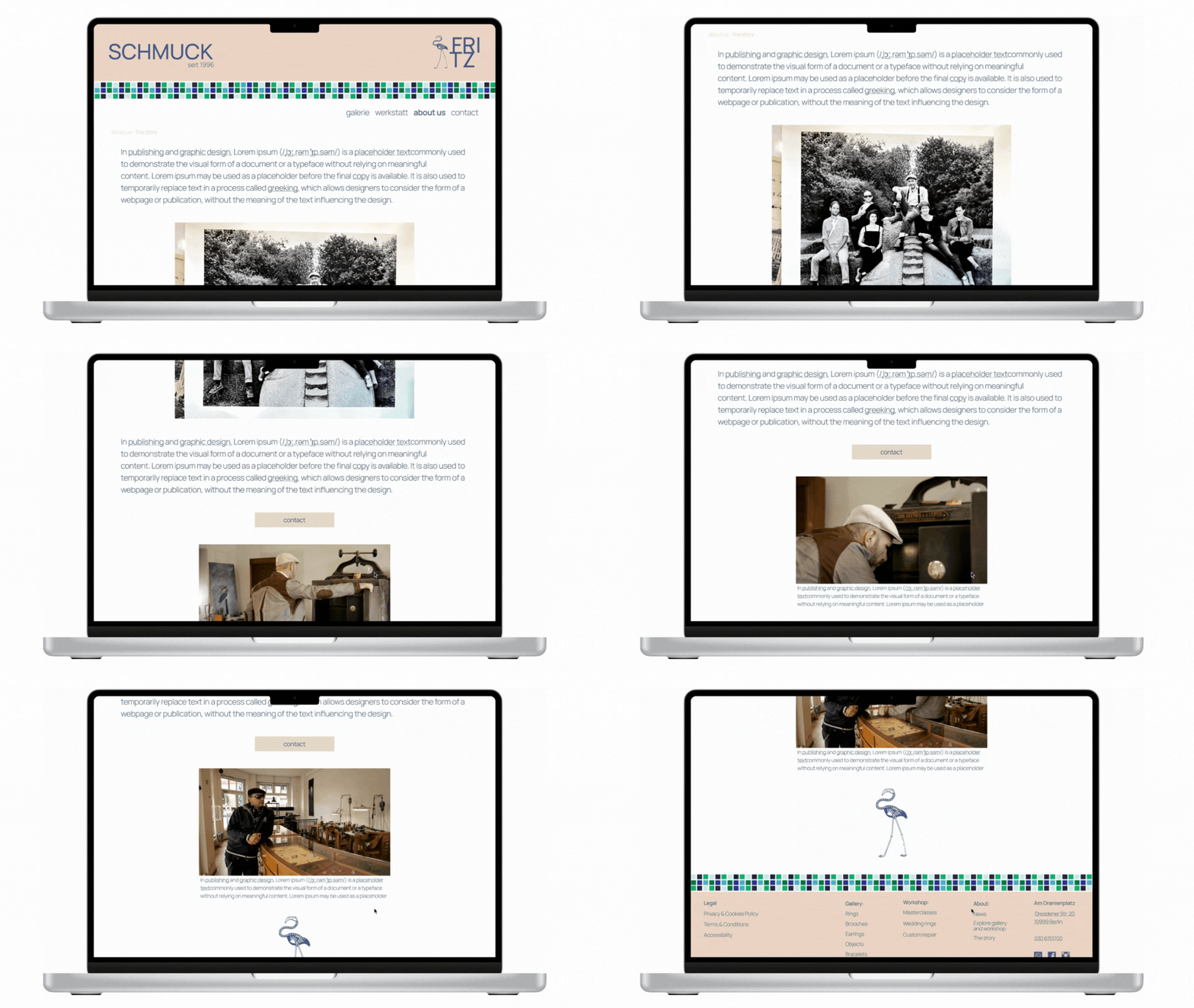
Image: "About Us" section - Business history.
And also developed a Contact page with an adress, map, opening time, and contact form.
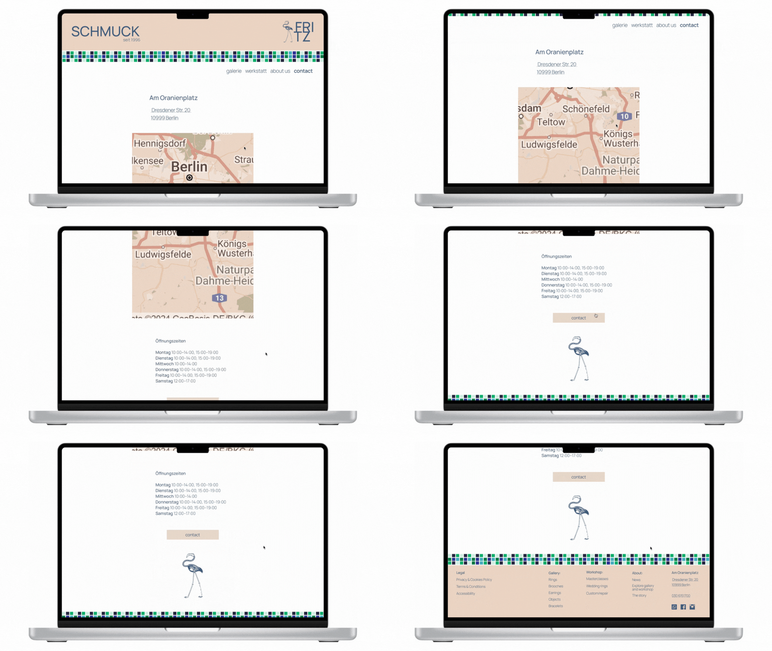
Image: "Contact" section.
Establishing a cohesive brand identity is essential for any business, as it helps convey a clear message and connect with customers. By integrating existing materials and focusing on design elements that reflect the brand's essence, we can create a unified visual experience.
I integrated all the existing materials from my customer into a comprehensive brand system. This foundation allowed me to ensure consistency across all touchpoints before moving forward with a dedicated design system. I chose Brand color system inspired by the facade of the building, ensuring that the palette resonates with the physical space and reinforces the brand's identity. Additionally, I utilized the existing logotype, featuring a skeleton of a flamingo, as a focal point for the design. To further align the brand's visual identity, I selected a font that closely resembles the typography found on the building, creating a strong connection between the brand and its physical location.
By bringing together existing materials and thoughtfully selecting design elements, I have crafted a cohesive brand and design system that reflects the unique character of my customer’s business. This approach not only strengthens brand recognition but also fosters a deeper connection with the audience, ultimately enhancing their overall experience.

Concept testing: Driving Moderated User Tests I spoke with 10 people, living in Berling. I showed them the header design, usking about do they know some place like this. And fortunently 6 of 10 responsed something as "Yay! I remeber this place!!! It is a jewelry store! What is its' name?" - "Shmuck", just "Schmuck"... - I answered, - But I am happy, that it works"..
During a lot of iterations, I build a web site Information Architecture, categorizing services and items in a gallery, providing structured information for each one separate piece (title, description, year of produce, artist name and name of collection), testing it on the early stage and each one time bringing the correctives. On the image belove you can see the final resut.

I put a lot of attention into “About us” and “Contact” sections, regarding to a users need to know about the story and inner processes more, implemented a high-quality photo content of the workshop and gallery today and also some of old, already historical for my customer business, photographies.
I created high-quality photo content and raised the old archive of stories and photographs in order to create an About page to give the client the opportunity to feel the atmosphere and vibe.

Image: "About Us" section - Business history.
And also developed a Contact page with an adress, map, opening time, and contact form.

Image: "Contact" section.
Key learnings
Copyright (c) 2024 Oksana Pravdina