Power of us

How we can create a social impact, to make this world a better place, together.
  • Role:
  • UX/UI Designer
  • Platform:
  • Application
  • Tools:
  • Fig Jam, Figma
  • Team:
  • 4 Designers
  • Scope:
  • 3 weeks


    Introduction

    When I was a child, I was firmly convinced that by 2020 it would be easy to buy a tourist ticket to Mars. But it didn’t happen. We, as humanity, got stuck in a bunch of problems separating us from a bright future, such as war, poverty, inequality, this list you may continue by yourself...
    Research and problem statement

    The people we surveyed were truly diverse; they had different lifestyles, priorities, and skills, but they were united by one thing: all of them were worried about the social issue. During user interviews, we also learned that most people feel disappointment and a sense of powerlessness due to the lack of ability to influence the situation. This sometimes leads to feelings of guilt, which may be familiar to my reader as well. At the same time, there are initiatives and organizations on the other side that need support but lack mass expression and simply "free hands". The mission of the Product is to connect them. We formulated the problem statement as:

    "An interested, but inactive person, needs a way to confidently join social initiatives, because they want to contribute, but feel like they don’t have an impact".
    So here’s the thing. The biggest path always consists of small steps. And we’ve designed a product that allows everyone who wishes to take these steps in the most comfortable way possible to avoid frustrating patterns. The concept that will connect the need with the resource. Making this world better. To connect the skills and free time with a project/initiative/organization in need of this type of support.
    Solution
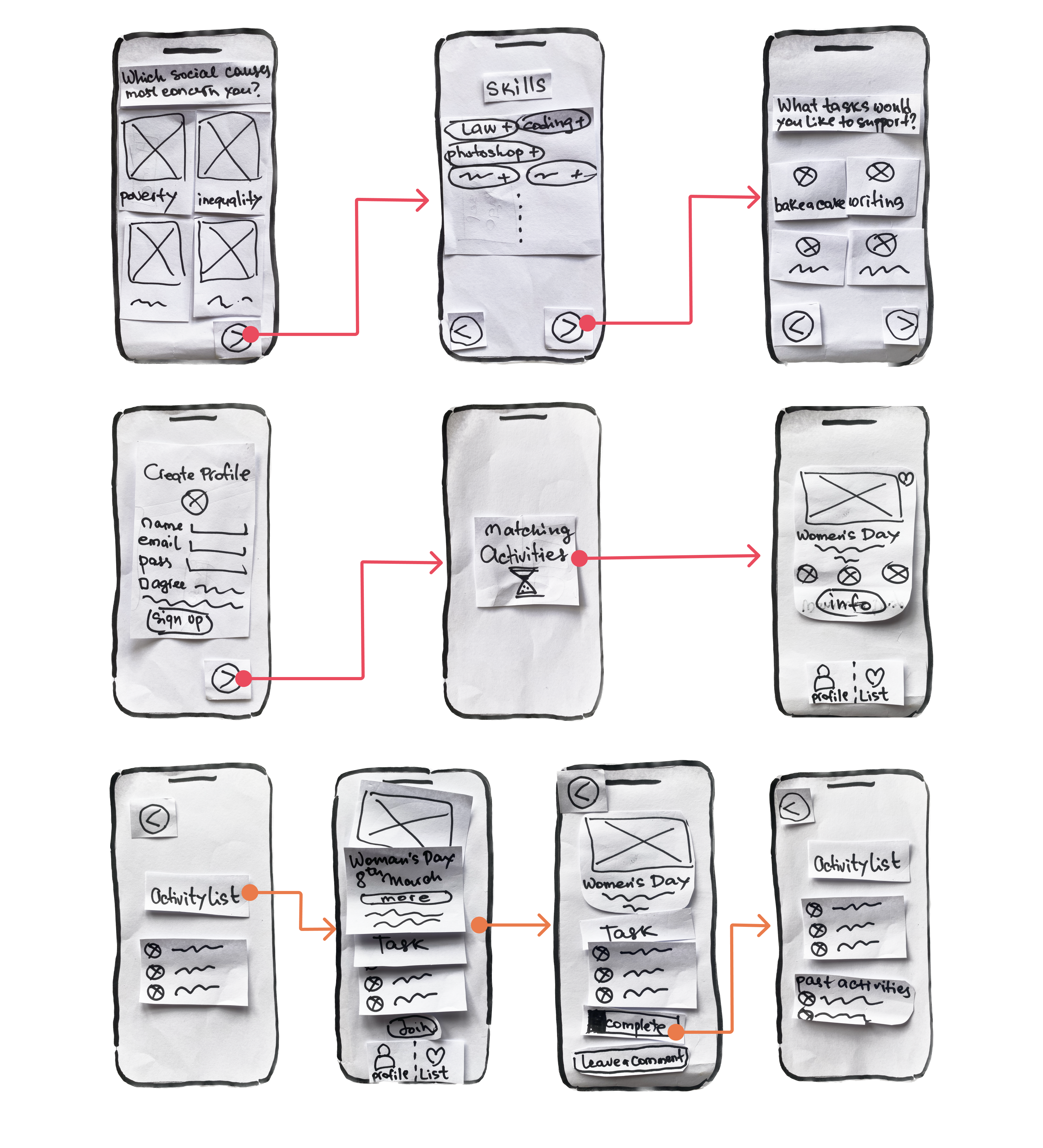
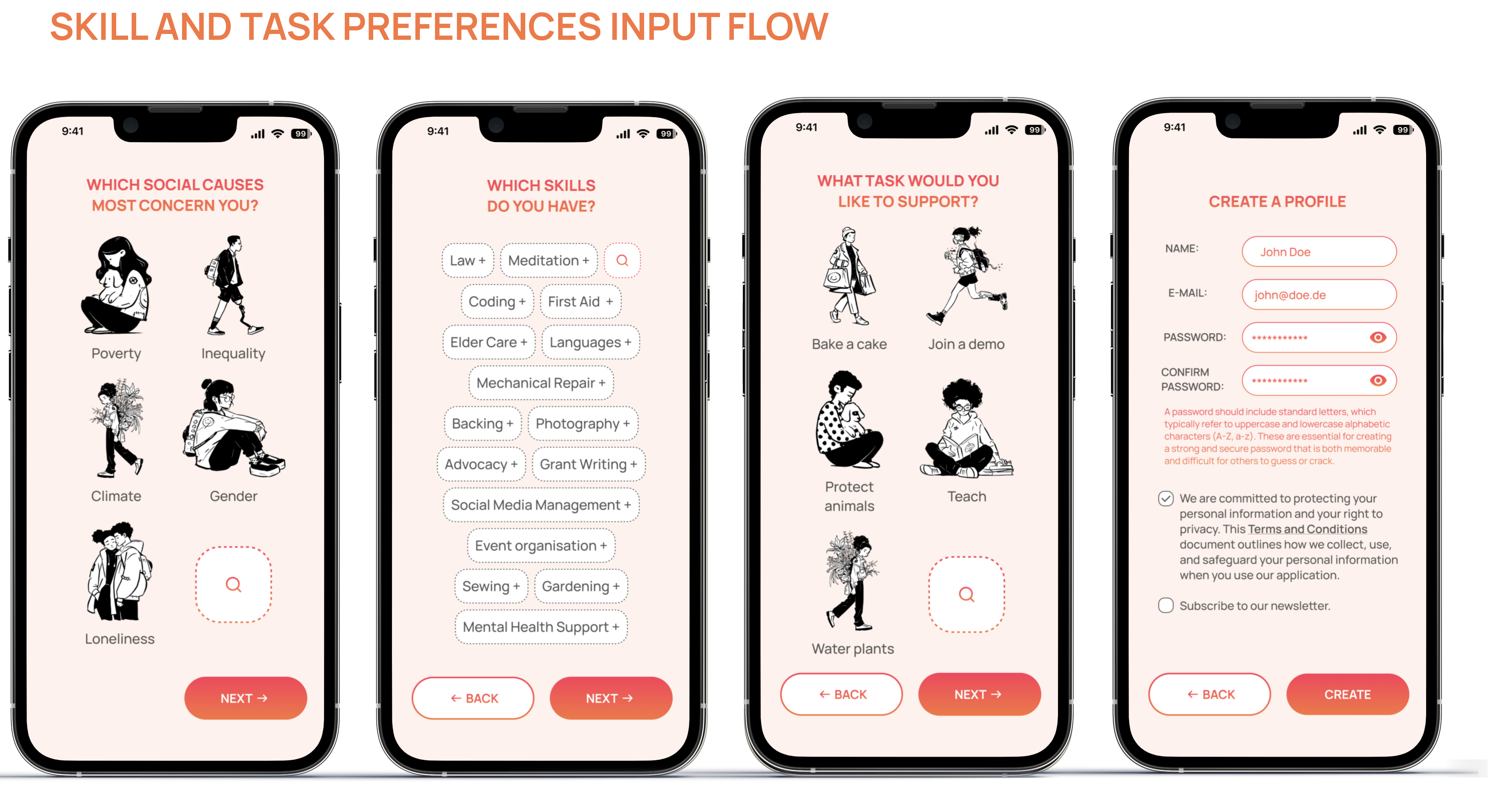
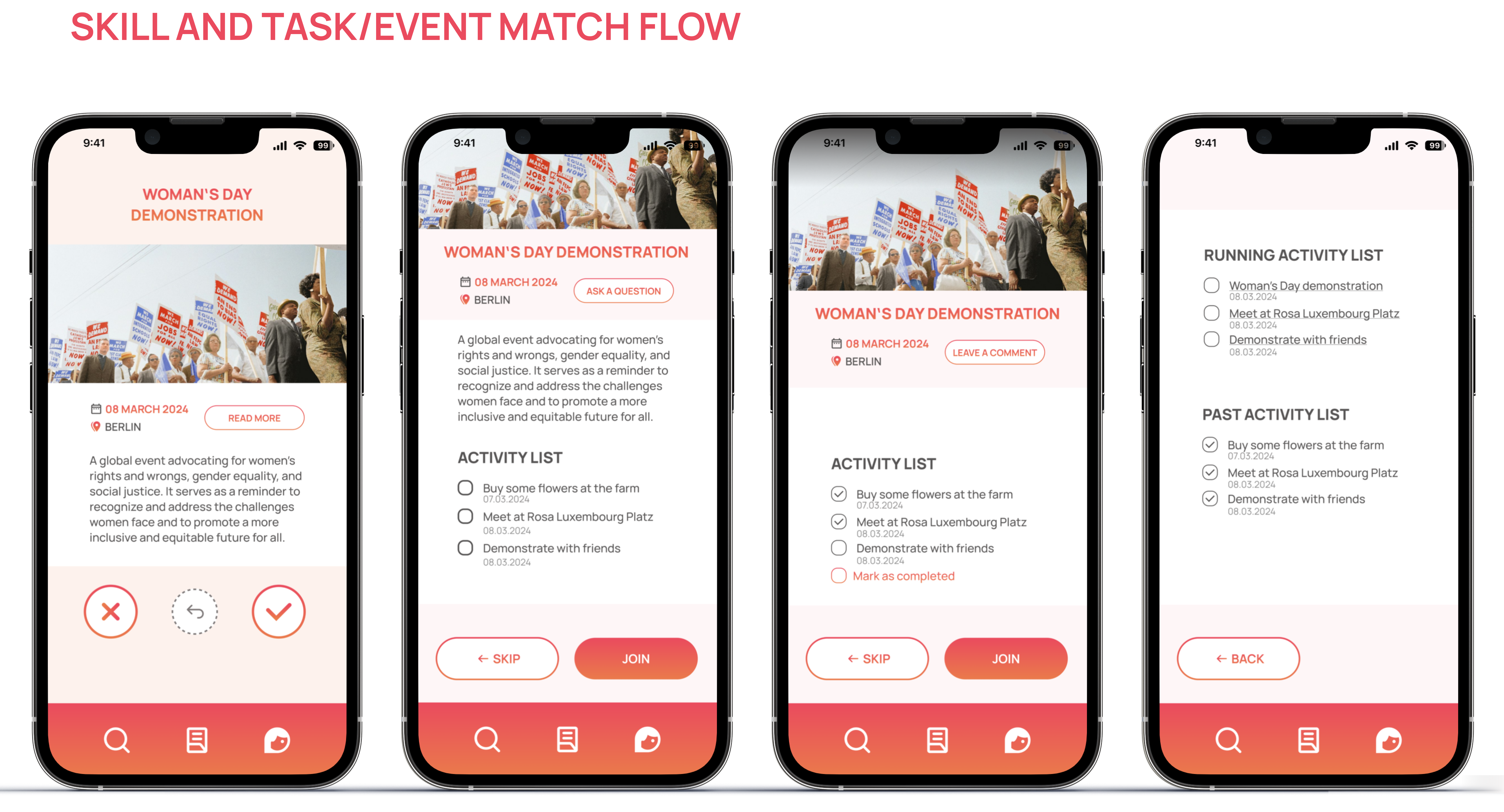
  • Specifically: the user can choose the most interesting areas of problem, then choose from the proposed list the type of desired activity and the resources and skills available. Location. And based on these parameters, in a gamified form, they will be offered to choose an activity for themselves at a preferred time. By swiping through the cards, we get information including about projects in which we may not participate, which nevertheless greatly affects our awareness of processes and activities in the selected directions in our location.

  • During the card review process, we can also go back to the ones we initially rejected and add events of interest to our selected list before making a final decision on participation and committing.

  • Additionally, there is also an option to view information with records on past events and activities of other groups and users, which may inspire us to participate in them next time and also visually see the result of influence and actions.


  • Using paper prototypes below for the Moderated User Tests we had two sessions, and both users confirmed, that gamified swiping system to choose an activity is clear and also makes a lot of fun. The UI also is clear.
    Design System and Branding

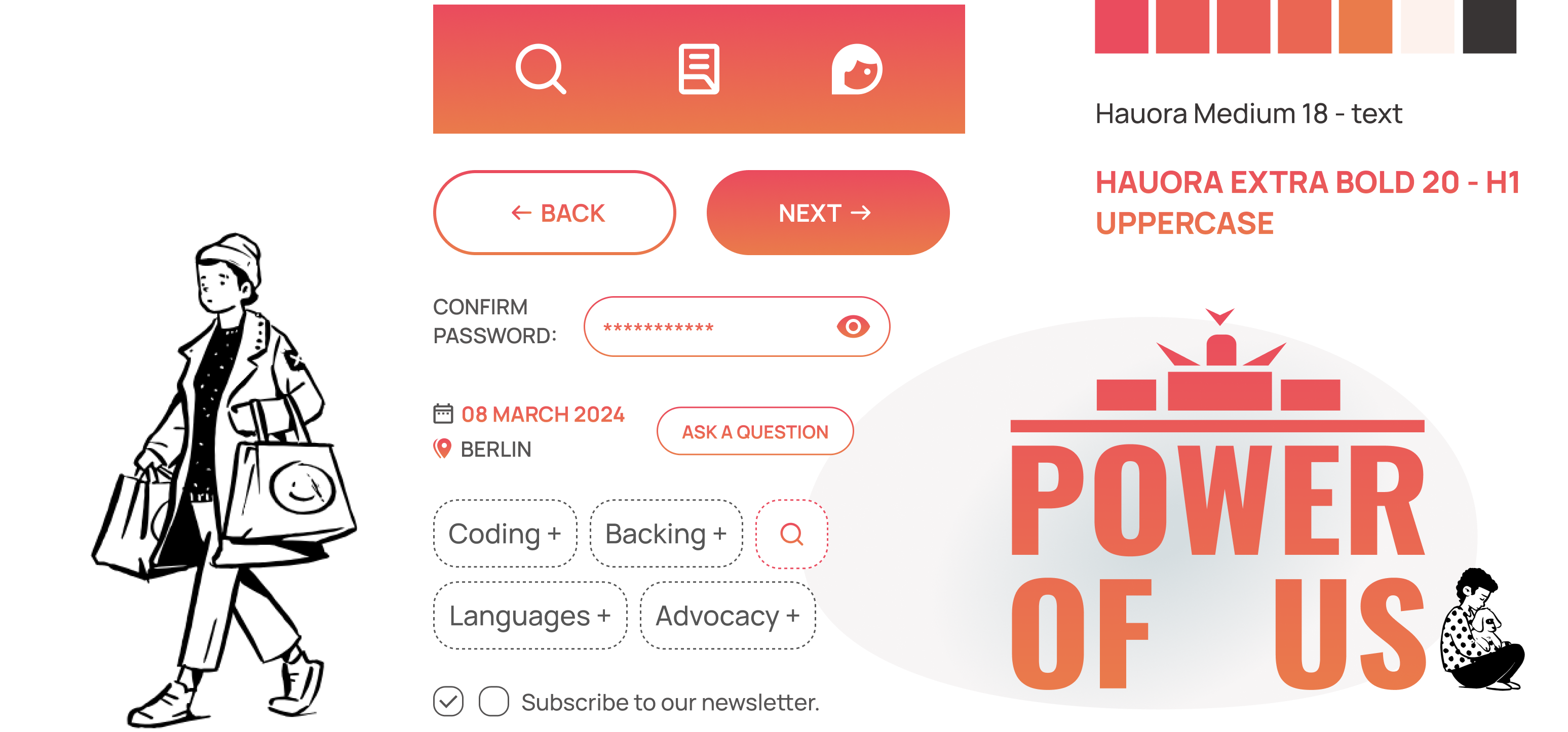
  • The app is designed to cover users who live in Berlin at first, that because I created a logotype, turning the letters of the Application name "Powef Of Us" into Branderburger Tür - one of the symbols of the city.


  • The providen Coral to Orange gradient precieps also same as red in general and provides warm and energetic feeling, that siuts very well to our goals.


  • High-Fi

  • This time to developing the inteface I played around with an AI tool called Uizard, wich lets to create a user interfaces just giving a promt, or a hand-drawn low-fi prototipe, as I did.

  • It was quite important to me to understand how deep we alredy going into this derection and for how long we will still need a Human Designer as it is. So I learned that the tool allows to save a lot of time and get a really nice structure. I worked deeper on a Visual concept , adding black and white graphic charactes, wich are turned back to back (screen 1) untill we connect them with a skills (screen 2) and then they are collaborating and liturally turning one to another (screen 3).

  • So yes, we still defentetly need a Human to give at least right promt. AI is great, but for now it is not possible to provide some desigions that is conceptual connected with a Metal Models we have.


  • Next steps:

  • Interviews with initiatives and projects to get a complete picture of their needs and structure.

  • Detailed study of activities and tasks.

  • Color system and UI Tests to confirm desigions and find more insights.

  • 😉 Problem solving
    🔎 UX Research
    👔 Business Analysis
    💡 Ideation
    ⛰ User journey
    🎡 Design Thinking
    📊 Information Architecture
    🪐 B2B
    👁‍🗨 Visual Concept
    📺 User Interface
    🦄 Figma
    🧪 Usability Testing
    👾 HTML & CSS
    💫 Concept Generation
    📖 Storytelling
    📟 Usability Design
    📊 Agile
    💬 Typoghraphy
    🧬 User Persona
    📍 Site Map
    🧶 E-Commerce
    🫂 User-Centerd Design
    📱 Mockups
    👩‍💻 Inerface Prototyping
    🧯 Branding
    🔎 User Research
    🔛 Product Design
    🟰 Acessability
    🧩 Design Systems


    Copyright (c) 2024 Oksana Pravdina